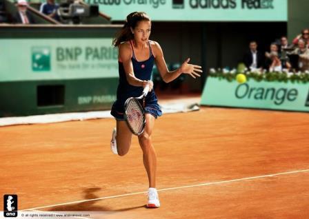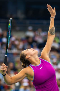
Ana Ivanovic‘s official website shared a photo of the Adidas dress the 2008 French Open champion will debut at this year’s claycourt Grand Slam. In November 2012 when we showed you the new Adidas designs, we thought that the blue and yellow Adizero racer-back dress was intended for the French Open, but Ivanovic sported the dress this spring in Indian Wells, Miami and Monterrey, and now we’re getting this information that the new design is in store for Roland Garros.
What do you think of the dress? At first glance it looks great to me – I love the hem of the skirt, the orange stripe contrast at the straps and the predominant color of the dress, even though it’s dark and I’m a fan of fun and bright tones. Can’t wait to see how the back looks.


I think it looks great on her.
I’ve always loved Adidas designs (except Mcartney’s) because of their understated elegance and sporty appeal, and this one is no different in my opinion. It looks clean and sleek on Ana.
Love the color, great contrast with the red clay.
Unfortunately in that pic we can´t see a lot of the design.
I also thought she was going to use the other (the Indian Wells one) so great surprise!!
I hope this mean that Adidas will have more outfits for the players per year like Nike have
It’s actually a really nice dress. Simple and sexy. Can’t wait to see her on court during the French Open 😉
I LOVE this dress. It’s really sporty and elegant,the best outfit Adidas produced in a long time. Hopefully she’ll wear it for more than 1 or 2 rounds.
I love it!!!
Nice dress! In one of my favourite colors,which stands out well on clay, this clothing line Adidas realizes for Roland Garros often goes unnoticed, but the design is sporty and feminine, the dress will surely be enhanced by Ana,that blue is also very well with her complexion!!
Here’s a closer look at Ivanovic’s RG dress:
http://pinterest.com/pin/494833077777590176/
http://pinterest.com/pin/494833077777590175/
Wonderful!
I love it! Thanks for the Pins, these made a closer look possible! I think it’s way better than the AO and spring line of Adidas, but that’s because I don’t like the yellow/blue and gray combi… (especially the gray)
Can’t wait to see it!
However, this means we’ll see dark colors for RG from both Nike and Adidas…. too bad. These are more US Open colors I think.
Liz, I actually love how dark blue contrasts red clay. Generally I prefer bright colors, but dark blue with nice orange details is perfect for Roland Garros. Plus, dark blue is somehow elegant and elite.
Yes, I agree with that, but somehow I don’t think it matches the season…
And it’s for sure that dark blue is elegant. The same thing applies for white 🙂
BTW, in NL they sell another color combination… Less pretty I guess: [link expired]
It’s less of a contrast.
Liz, I think it’s the same color, probably the one Ana is wearing in the picture seems darker and with more vibrant details because the photo is retouched… Curious that the logo is in different position…
I also think it’s the same dress. Good observation Francesca, it’s strange that the logo is positioned differently. Actually, here on Ana there is one logo and on the link Liz shared there are two.
I have the impression that the photos of Ana was taken in a studio, maybe the dress is a kind of prototype used for the advertising campaign, we just have to wait to find out where the logo will be! 🙂
Oh well… On Tennis Warehouse the dress is identical to the one worn by Ana, colors an logo position… The mystery deepens!
It looks so nice.
Yes, the position of the logo surprised me too… And I guess you’re right anout the retouching.. too bad though, I think the brighter version is more pretty 🙂
I absolutely agree with every/-anyone: if that logo was just, let’s say, a sixteenth of an inch more to the right/left: WOW!
Does someone own it? I am obsessed since back then 🙁 Please help me