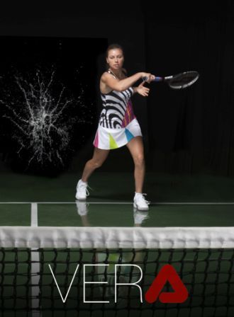
Fila has recently released new photos they did with Vera Zvonareva. As you can see, there are plenty of colors in one place, but well matched. I’m a fan, especially for spring.
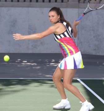
Fila is known for their classic apparel, and the biggest departure from the traditional Fila, as far as I remember, has been Kim Clijsters’ Monica Seles-inspired outfit. But seeing these Zvonareva’s clothes, I can conclude that Fila is testing new grounds. Do you like the new Fila?
There are also some more classic designs, typical Fila. I’m liking them all!
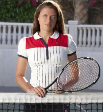
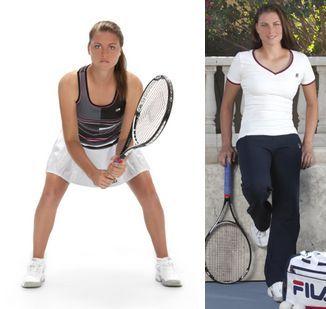
Reminder: Zvonareva is pretty new in the Fila family, she switched from K-Swiss in the beginning of 2012. (via The Slice)





Fila, as well as, for instance, Lotto, or even Lacoste (!), seems to often escape the eye of the general public, enchanted as it is by the enormous amount of (money put into the) marketing of the design-wise much less successful brands (such as, for instance, the awfully overrated, because hyped-up, Nike, or the “exclusive [not the regular!] line” of Adidas). Nice reminder, Marija – and a pretty good eye, too. “I’m liking” it (by way of trying to adapt to, as Shakespeare would probably call it, the newfangled grammar).
Tulp, Adidas is my favorite brand, and I can’t say I don’t like Nike, but I admire Fila for their classic style which has always stayed on its own track, faithful to itself, but still modern.
“Liking”, honestly, I don’t know where I got it haha. Maybe from a McDonald’s ad. 😀
I think there’s a little bit too much of everything. The colors are nice, but I think they should stick to the simple, plain white on the rest of the outfit, because with this black/white curves, looking like an enlarged finger print, my eyes are getting sore.
Maggie, I just tried to answer your question on the other thread, only to discover this new comment of yours… First (and most important of all!): I love your comments, because they are thoughtful, searching, engaged… simply: real (as opposed to the, sadly, prevailing perfunctory ones). Second, there is much truth to your critique: there is often “a little bit too much of everything” in many designs, mostly due to the ridiculous pressure of the seasonal competition designers are exposed to. Now, to elaborate this would take an essay of I-don’t-know-how-many words, but the point I was trying to make (which Marija understood, so I’ll sort of quote her) is the following: There are brands which, in spite of the pressure mentioned, unceasingly develop their own (version of) aesthetics (or “look”) and sometimes, under the pressure, don’t deliver the optimal solution, but mostly do – and there are brands that actually do not even have their own (version of) aesthetics, but simply play the marketing game. The latter is best exemplified by Nike (and here’s where Marija’s and my own way part): Nike, actually, has no recognisable developing aesthetics; design-wise, it all seems to be a hit-or-miss game – yes, there are hits, but also many more misses. Why? Because they are bent on manipulating and/or following the general “taste”, instead of developing it (I still get goosebumps every time I see their blue/black combination, even on Federer!), while, for instance, Adidas, Lacoste, Lotto, Fila, etc., do the opposite, and, therefore, have, design-wise, many more hits than misses. P.S. I’m truly looking forward to your future comments.
Tulp, I like to see my readers giving appreciation to each other. It’s nice of you 🙂
Marija, you shouldn’t mention it… It comes (or should come, anyway) as a spontaneous reaction to any spontaneous (searching, prejudice-free) action. Be as it may: I don’t know, but I suspect there’s a blush on my face right now.
No need for blushing 🙂